Kibblio
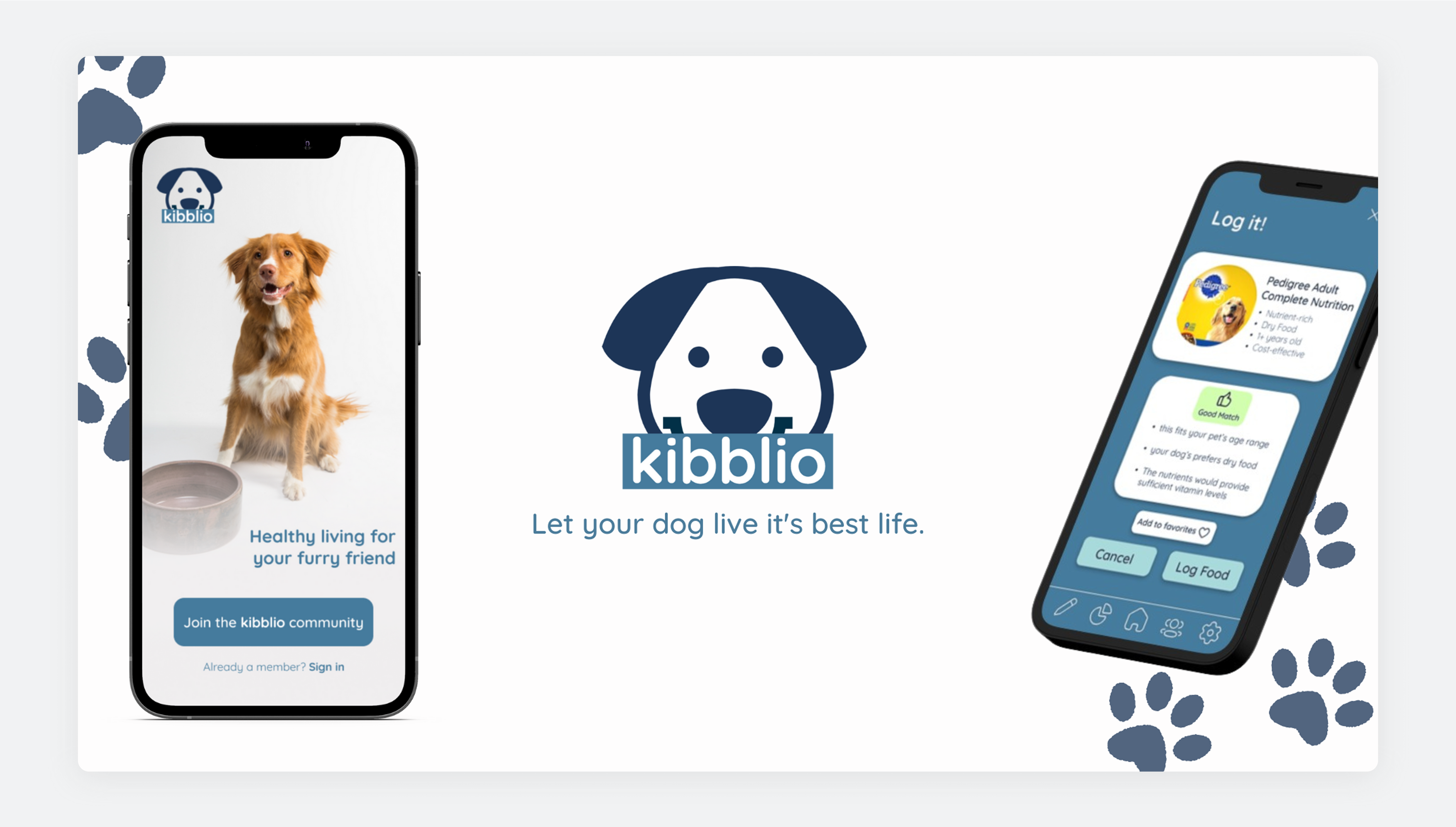
Kibblio, a mobile app for dog owners, aims to showcase a refined mobile app prototype for tracking pet nutrition.
Applying user-centered UX design methods, including empathizing, researching, ideating, wireframing, prototyping, usability testing, and iterations, I created a prototype that dog parents would consider using.
Challenges
-
Create easy point of entry for new users
-
Make the UI accessible for all users
-
Ensure user flow is easy and intuitive to navigate
Empathizing
To start this project, I conducted user research to understand the dog owners I was designing for. This allowed me to effectively use my findings in my initial design work. Since I had no stakeholders, I needed to understand this audience to ensure an effective design.
I cast a poll for dog owners in my area, aged 20 to 50. Their pain points were clear and representative of many dog owners. I compiled this data into four distinct themes, making it easier to identify potential solutions.
User Research Themes
Lack of Knowledge
Often people don’t know what kind of nutrition to give their dogs. Giving them an option to find out the nutrition needed is key to the design of this app.
Too Many Choices
With so many choices of foods, treats, supplements, and different brands – how can you know which one is the best? This app would be designed with clear choice making in mind.
Dog doesn’t like their food
Sometimes dogs like the food you give them - for a variety of reasons. With this, you can find alternatives to their food that are still nutritious for them.
Expensive Vet Visits
The amount of money and time spent going to learn about a dog’s nutritional needs can be too much. Finding out this information through an application is a quicker alternative for both you and your pet.
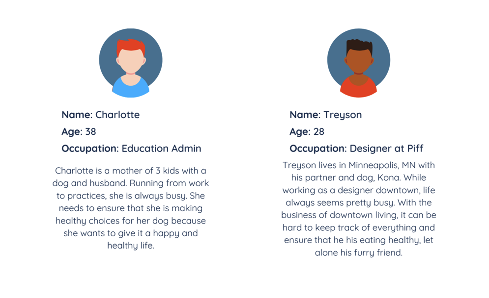
Personas
Competitive Analysis
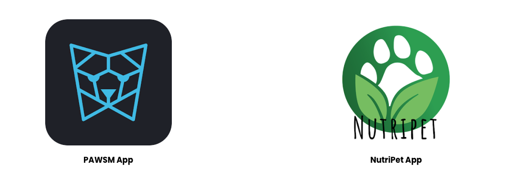
I looked at two potential competing apps that were in the iOS app store. Since they can infringe on the business’ revenue & popularity, they were deemed both competitors. Kibblio has the opportunity to capitalize on this area by creating a great experience within the dog-app community.
Many of the features found in the other two apps were similar, however these were the main differences I wanted to capitalize on:
- Out of date interfaces
- Issues with responsiveness
- Tech feel vs laid-back feel
- Cohesive brand tones
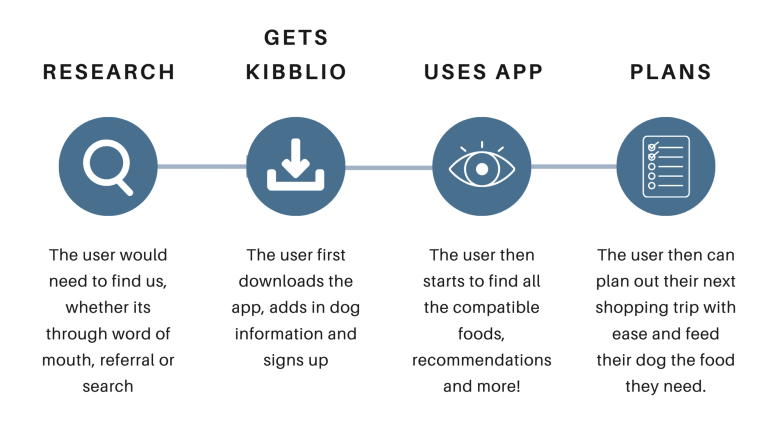
User Journey
In order to fully empathize with the user, I needed to create a user journey map based on the personas that I developed earlier in the design process. By boiling down the user journey to these simple steps, I could narrow down what features I’d need to design in the app itself.
Design Process
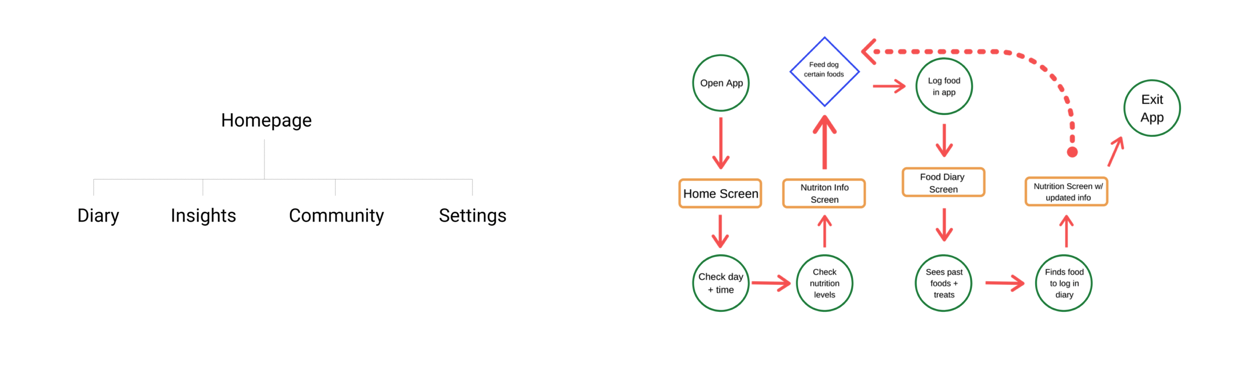
After empathizing with the user and their journey, it was time to create the user flow of the app design. The pages coincide with the solutions I wanted to provide for the user, as they each helped alleviate one of the pain points found in the initial research.
Then I took those page ideas and connected them in the user flow breakdown to see what a user’s journey through the app would look like.
User Flow
Wireframing
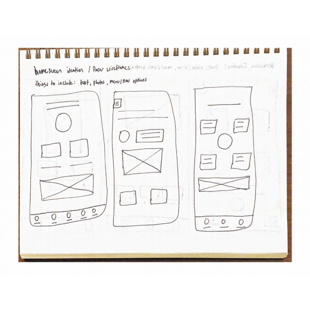
In order to come up with wireframe ideas, I used the design method of “Crazy 8’s” where I had limited time to sketch out ideas. This helped me create a wide variety of solutions for my different app pages.
Prototyping
Taking information architecture and user touch-points into account, I refined my paper wireframes and transformed them into digital wireframes with the help of Figma.
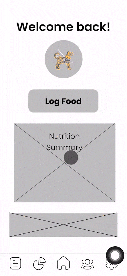
This prototype has basic user flows such as being able to log a generic food, navigate the menus and understand the basic options that users will have within the app’s structure.
Testing & Iteration
After completing unmoderated usability studies with 5 different users, it was clear that some things needed to change. Upon completing some of Kibblios most basic user flows, they happened to find some areas that needed improvement.
The three themes from my research that stuck out were:
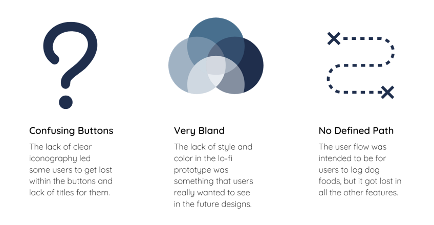
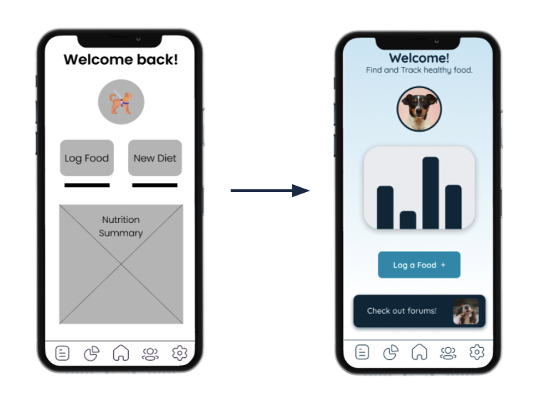
Lo-Fi Prototype 👉 Mockup V1
The first mockup really brought Kibblio to life and it was really great to see how some color and refined button types could make the app a reality. Users were genuinely impressed at the UI and features that were available.
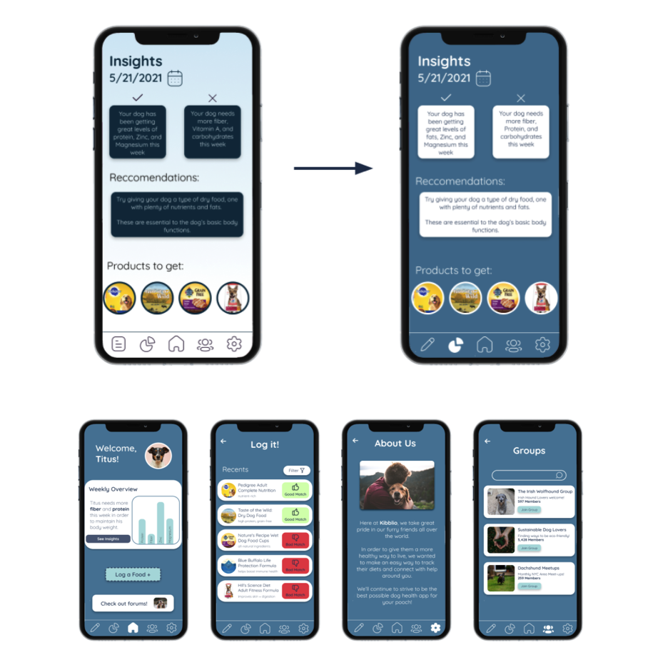
Mockup V1 👉 Mockup V2
After some user-feedback, I decided to change up the color scheme of the app to make some portions of the app more accessible. I also thought that the overall blue really made the elements pop out on the screen.
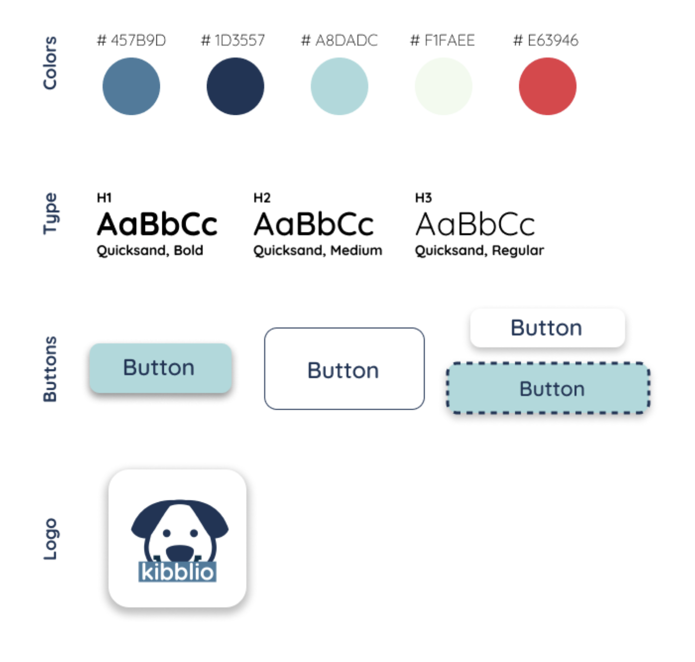
Style Guide
In creating Kibblio, I considered colors that blended technology, well-being, and canines. After multiple revisions, I settled on a style guide that fit the app’s design. Many users were impressed by the design choices and had pleasant experiences during user testing.
Project Takeaways
A few things that I would do to further my progress on this mobile app would be:
- Do more user testing to get feedback
- Try out designs with a vet, dog rescue or dog boarding place to see if they would have any more ideas
As a dog lover, Kibblio was an amazing project to start with. It inspires me to start UX design. This design process made me realize how much goes into everyday designs. Turning an idea into reality is powerful.
This project taught me about putting the user first, ensuring accessibility, and information architecture. I also learned that there are no limits to iterations, so future iterations of this app may come!
Thanks for reading my case study. I hope you enjoyed it as much as I enjoyed creating it!