Mindful Care
Led the design efforts for a patient self-scheduling feature within our ever-evolving intake process. Ultimately, the most impactful aspect was witnessing the positive outcomes in facilitating patients’ appointment scheduling and ensuring their satisfaction.
This feature has been shipped to the average 2,000 weekly new patients that sign up for Mindful Care services.
| Role | Duration | Team |
|---|---|---|
| UX/UI Designer | Jan ‑ May 2024 | Product, Engineering, Marketing |
High-level Overview
Context
Mindful Care is an Urgent Mental Health start-up focusing primarily on same-day and next-day care for their patients’ urgent concerns. Similar to an urgent care facility, the patients coming in are expecting to see someone in a timely manner. Mindful Care, striving for tech-enabled efficiency, is challenged by a manual patient scheduling process.
Problem
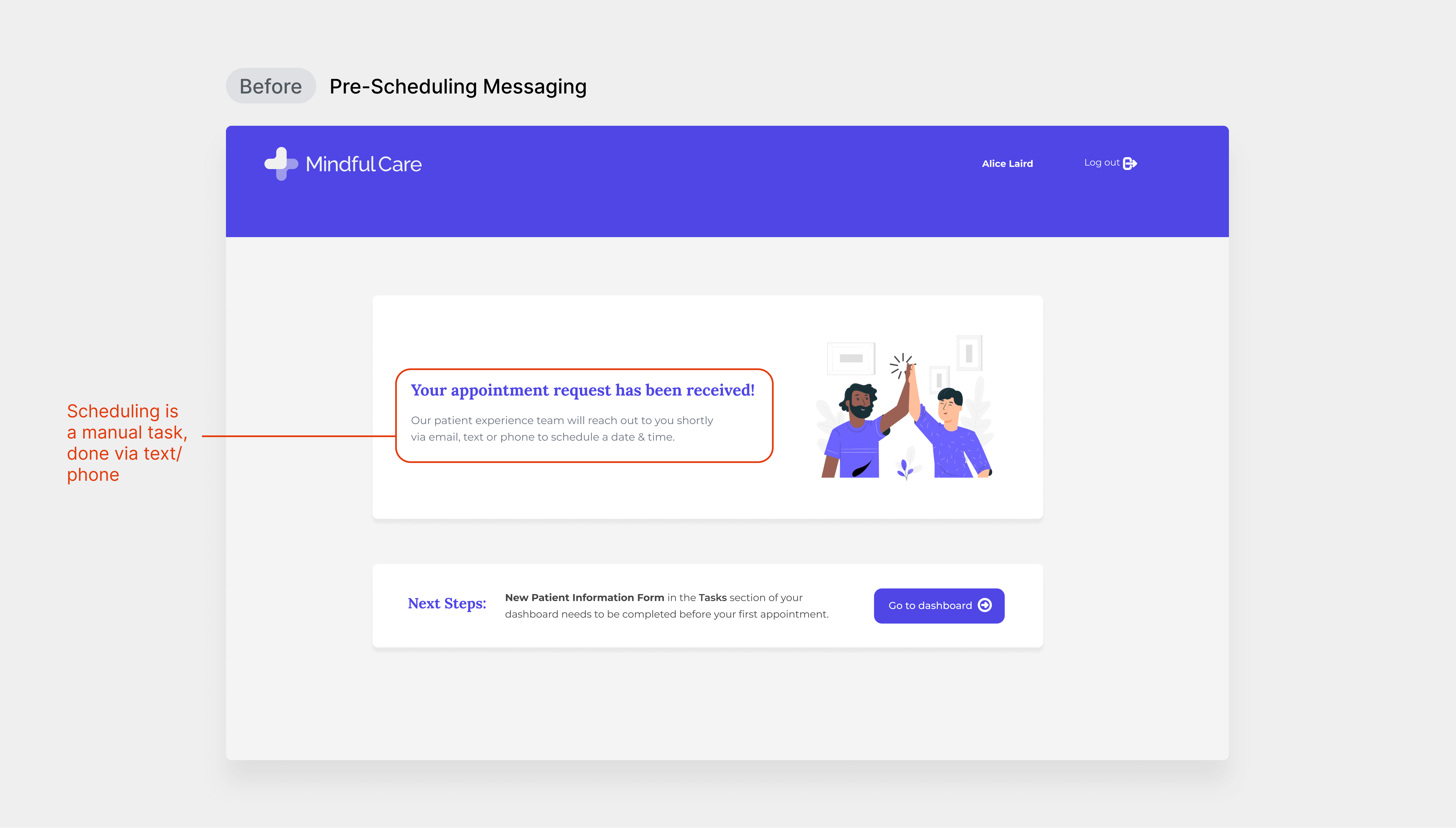
Patient Perspective
In order to get an appointment, patients must fill out all of the critical information in order to be scheduled. All the while, they may be in a state of distress and having to fill out information without ever receiving a same-day guarantee of the day and time of an appointment. Currently, once a patient has filled out enough information, a request is sent to our scheduling team.
Scheduler Perspective
Once the patient’s information is passed along, it is a very manual, tedious, and time-consuming effort for schedulers to follow through. The scheduling team can only handle so much, and often unknowingly schedules appointments during inconvenient times. Combined, this reduces the chances of appointments being scheduled, and often results in high cancellation rates regardless.
The inefficiency of both the intake workflow for patients, and the process for our scheduling team has a high impact on our core mission of serving mental health patients in a timely manner.


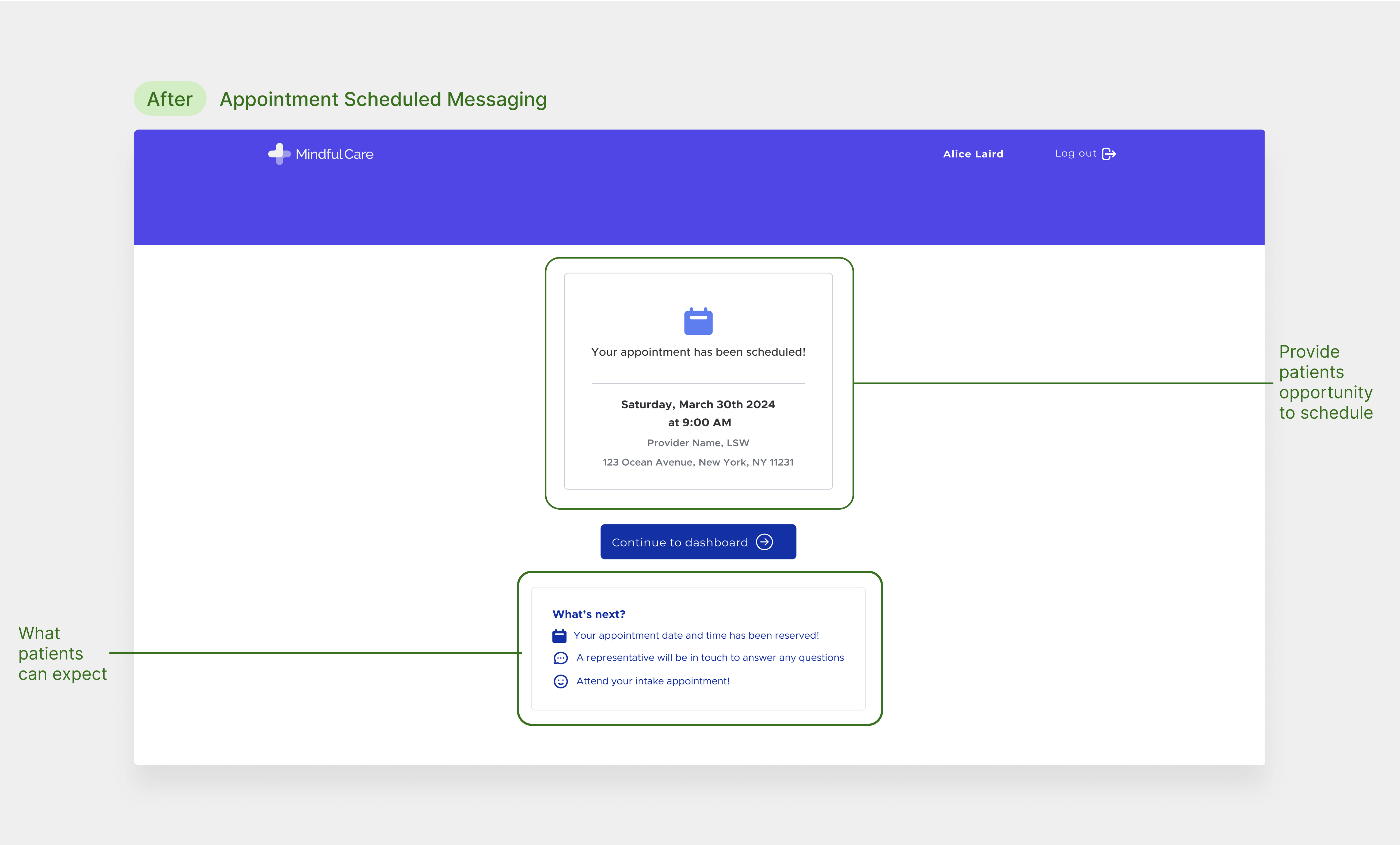
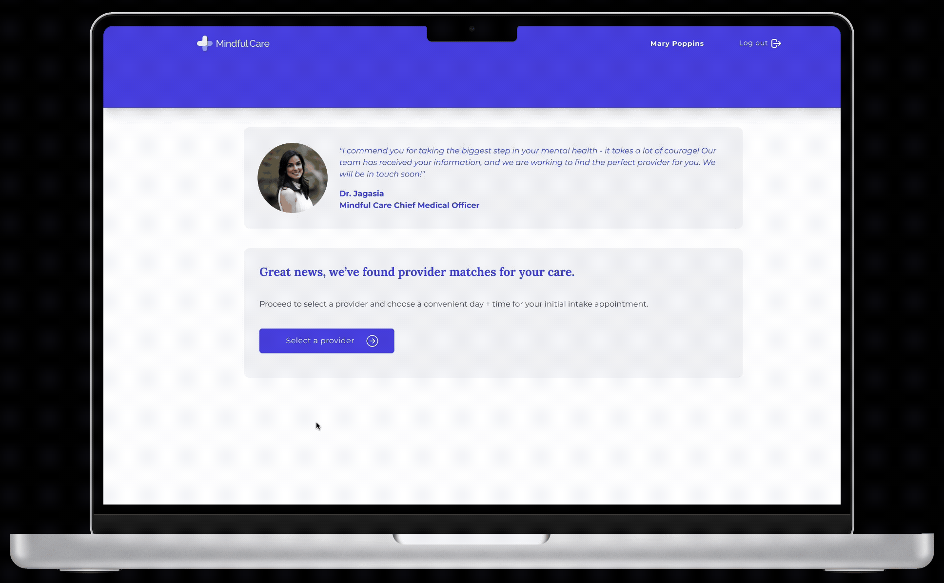
Final Product
The improved scheduling process allows patients to find a provider match, find an open day and time, and reserve a time before continuing through to receive care. This result gives patients more control, streamlining scheduling, and decreased the amount of no-show appointments.
Full Design Process
Research
To better understand our patients pain points, I led 8 interviews and synthesized qualitative survey feedback I’d been collecting over the course of 2 years.


Impact
Mindful Care schedulers averaged 73 new appointments daily, spending about 12 hours scheduling patients and coordinating times. Equating to roughly $5,000 per month in timecost, optimizing scheduling would allow them to focus on more critical cases and improve patient experiences.
“It was over a week before anyone responded to my initial application, less than ideal. I would have appreciated scheduling a time so I knew I had an appointment"
-Patient, Mindful Care
“We spend the majority of our days doing outreach and scheduling patients. To have that lessened by even a fraction would help us out tremendously as a department."
-Patient Experience Team Scheduler, Mindful Care
Opportunity
Providing a way to schedule more efficiently, or give the ability for a patient to schedule their own preliminary appointment would help create a better experience for them and optimize the efforts of the scheduling team.
Prioritization
In working with the Product, Engineering, and Patient Experience Team, we discussed the current provider matching workflow alongside the user experience. The decision boiled down to prioritizing something we called self-scheduling.
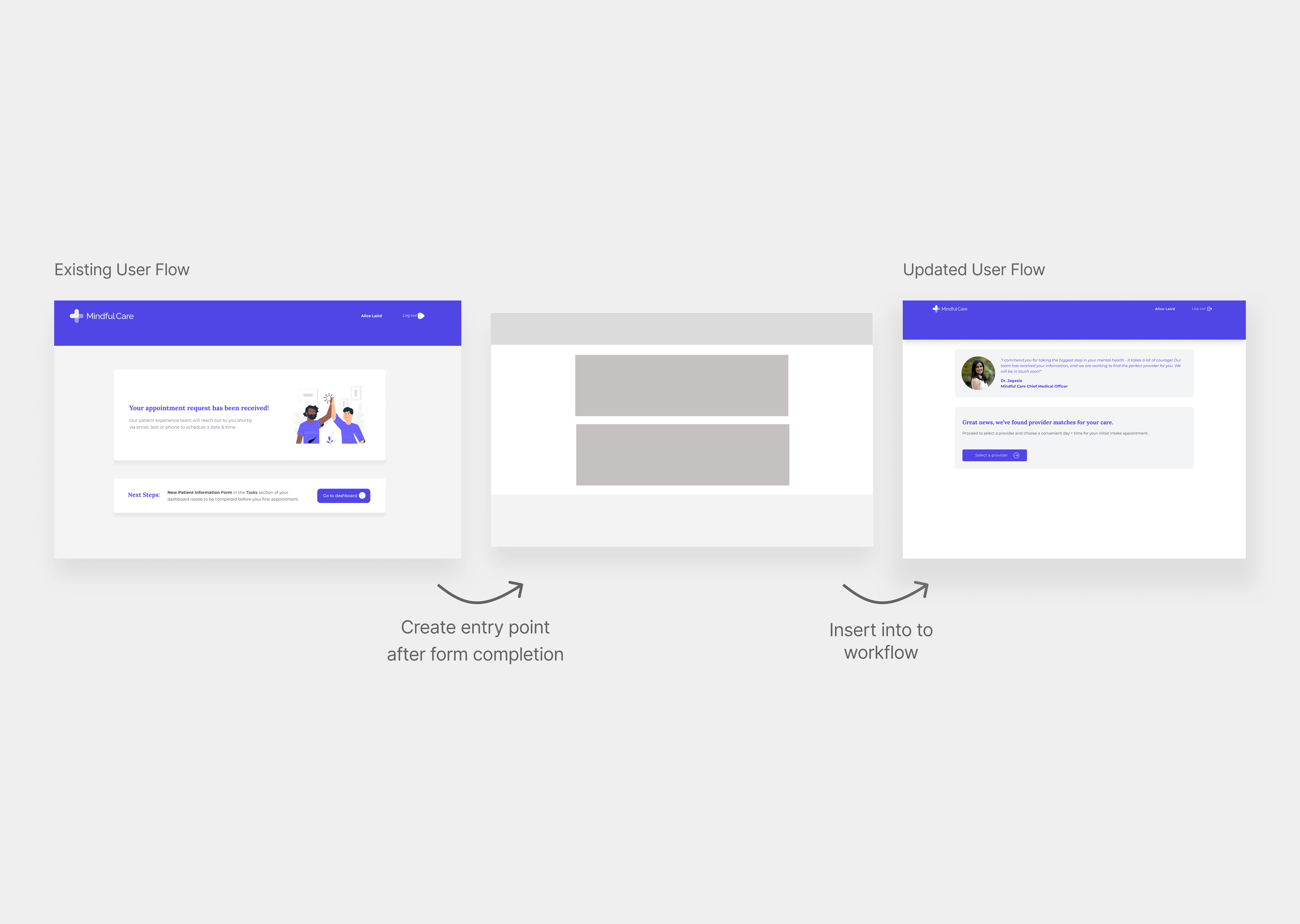
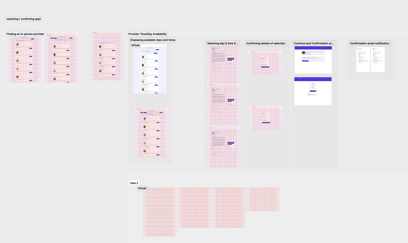
Design Decision #1: Creating an entry point
Patients signing up needed a convenient way to select a time during the registration process. After our intake workflow, where we capture critical information for both care and business practice, my team found an ideal spot to place this.
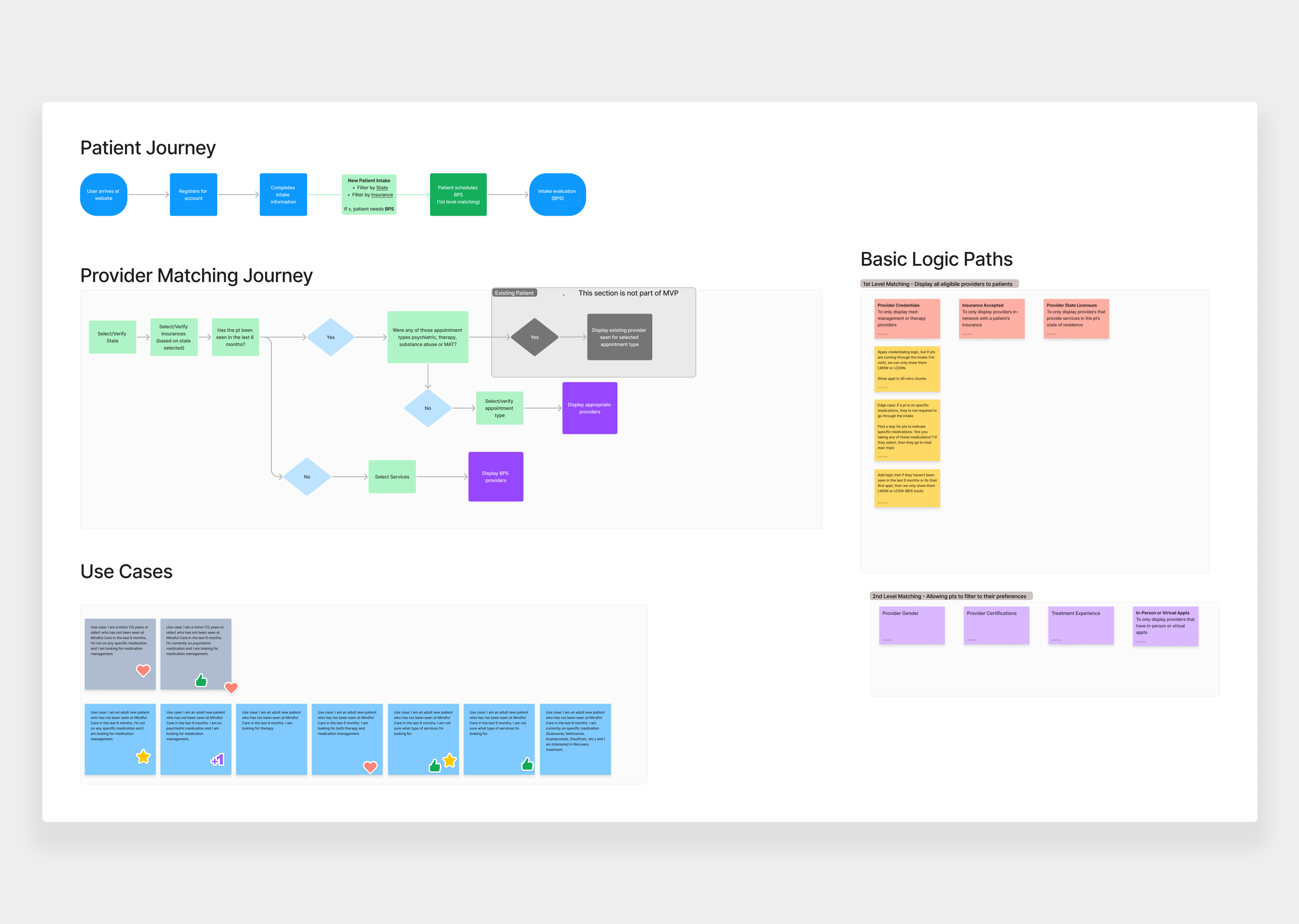
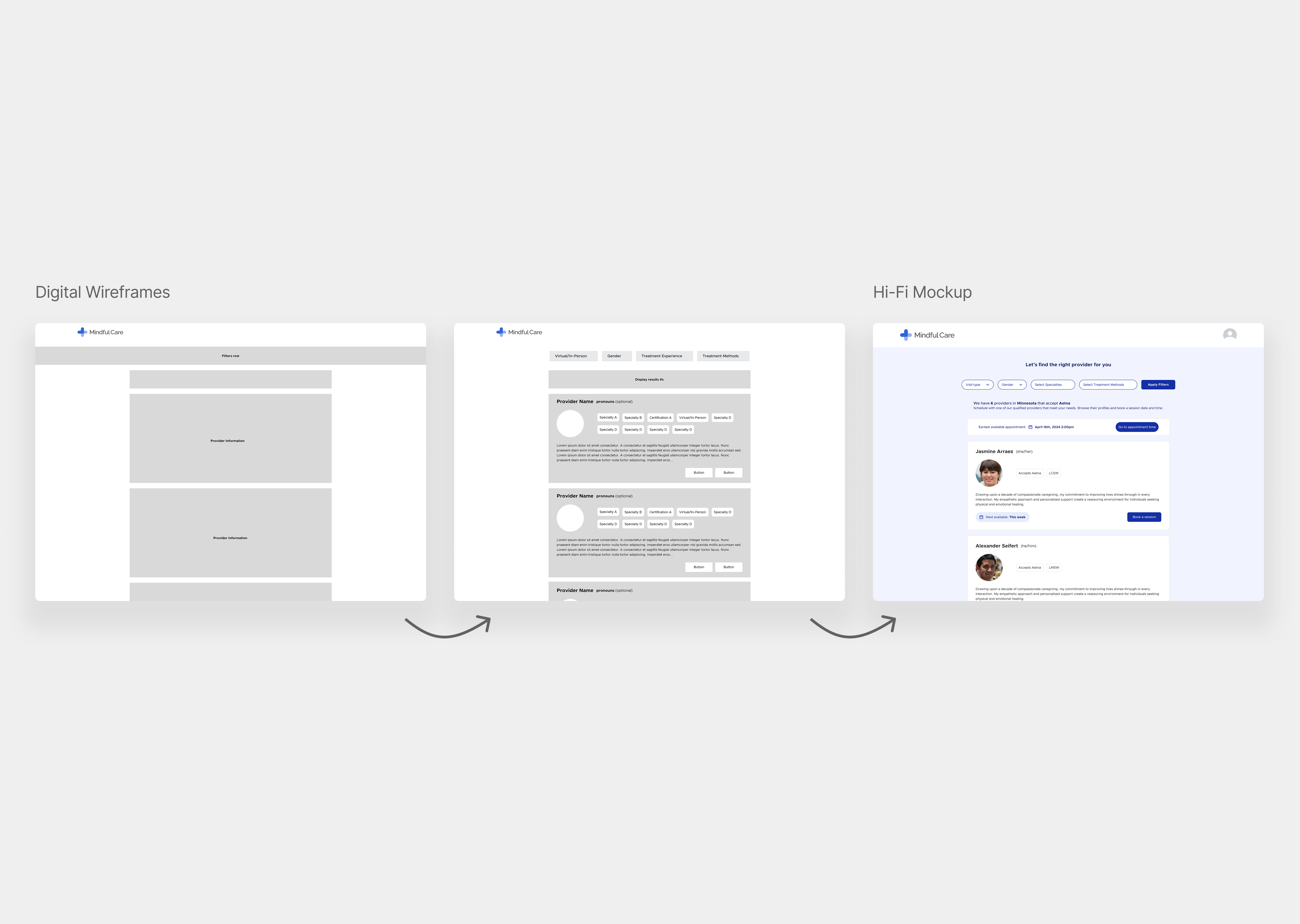
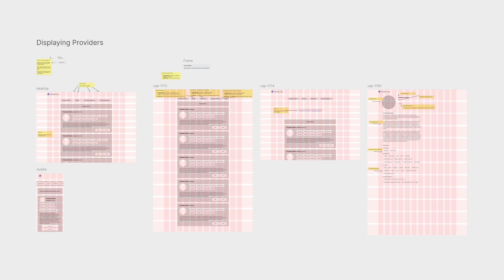
Design Decision #2: Displaying Providers
In order to give patients the option to choose a provider for their sessions, we had to display any and all applicable providers. With some backend logic, we were able to filter for State, Insurance, Service and any additional preferences the patient added in.
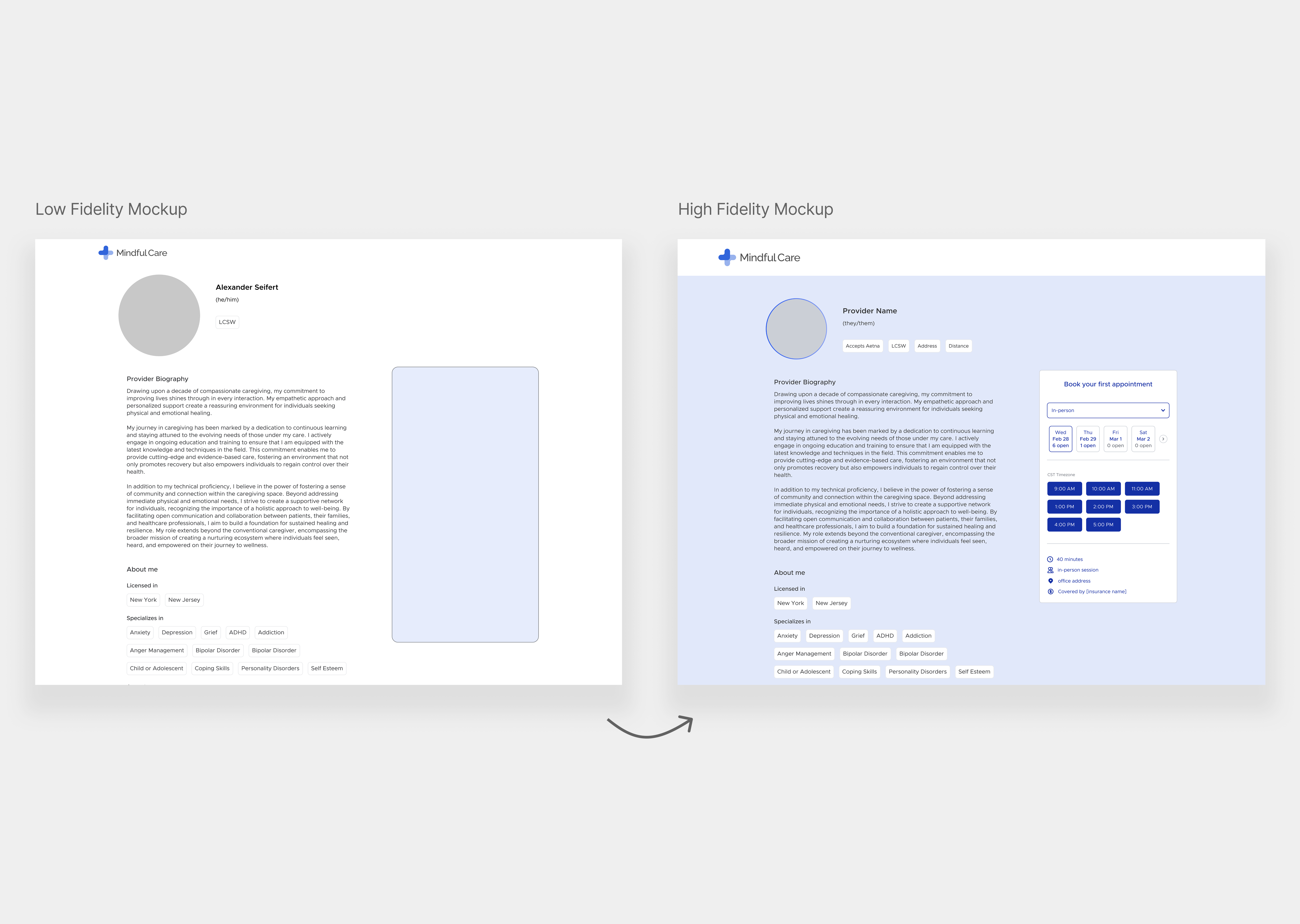
Design Decision #3: Displaying Provider Information
In order to know if a provider would match their preferences, a patient would be able to learn more about them on their profile page, as well as select an available time and date from a scheduling component
Final Prototype
After many versions of screens, user testing, bug fixes and more – the team finally was able to create our first version of self-scheduling that was successfully launched to the patient audience. Similar to the animation below, new patients were able to select a provider and book an appointment upon launch.
Design Handoff
Since we worked primarily out of Jira, I created feature-specific Figma file sections for each task within a file. I often added sticky notes to provide behavior and state details. Close collaboration was needed to deliver this flagship feature within a 5-month timeframe.
Outcomes

Takeaways
I enjoyed many of my projects with Mindful Care, but none of them felt like they had as much as impact as this one. Not only did we deliver something that patients wanted, but it helped out our scheduling team efficiency and saved us hours of manual work. Through lots of cross-functional discussions, bug-squashing sessions, user-feedback sessions and more - we found a way to get this to our patients.
This project taught me that you can’t let perfection be the enemy of good. Make something that works, ship it, and learn from there.