Top Echelon
I led a redesign for Recruiting Software company Top Echelon for their marketing website; starting with researching, identifying key sticking points, and onto designing and handing off to external developers for implementation. The new website will save customers time and energy in gathering critical information to starting a Top Echelon subscription.
This website has been live for an average of 30k monthly users in traffic.
| Role | Duration | Team |
|---|---|---|
| UX/UI Designer | June ‑ Dec 2021 | Marketing, Engineering |
High-level Overview
Context
Top Echelon is a recruiting software designed for small and medium recruiting businesses (SMBs). I helped optimize the website to make it easier for recruiters to find the information they were seeking to learn. Recruiters use this software (ATS systems) to help source, connect with, and place candidates in roles.
Problem
After analysis and research, I discovered that the Top Echelon website needed to connect with it’s audience better. Recruiters wanted to see and hear what the recruiting software was all about: features and how they would help, as well as others’ experience with the recruiting software product. My hypothesis was that without these key details accessible, new trials would remain stagnant.

Final Product
The refreshed Top Echelon website provides recruiters with features and answers they seek in an ATS system, empowering them to make informed decisions while maintaining a positive brand experience.
Full Design Process
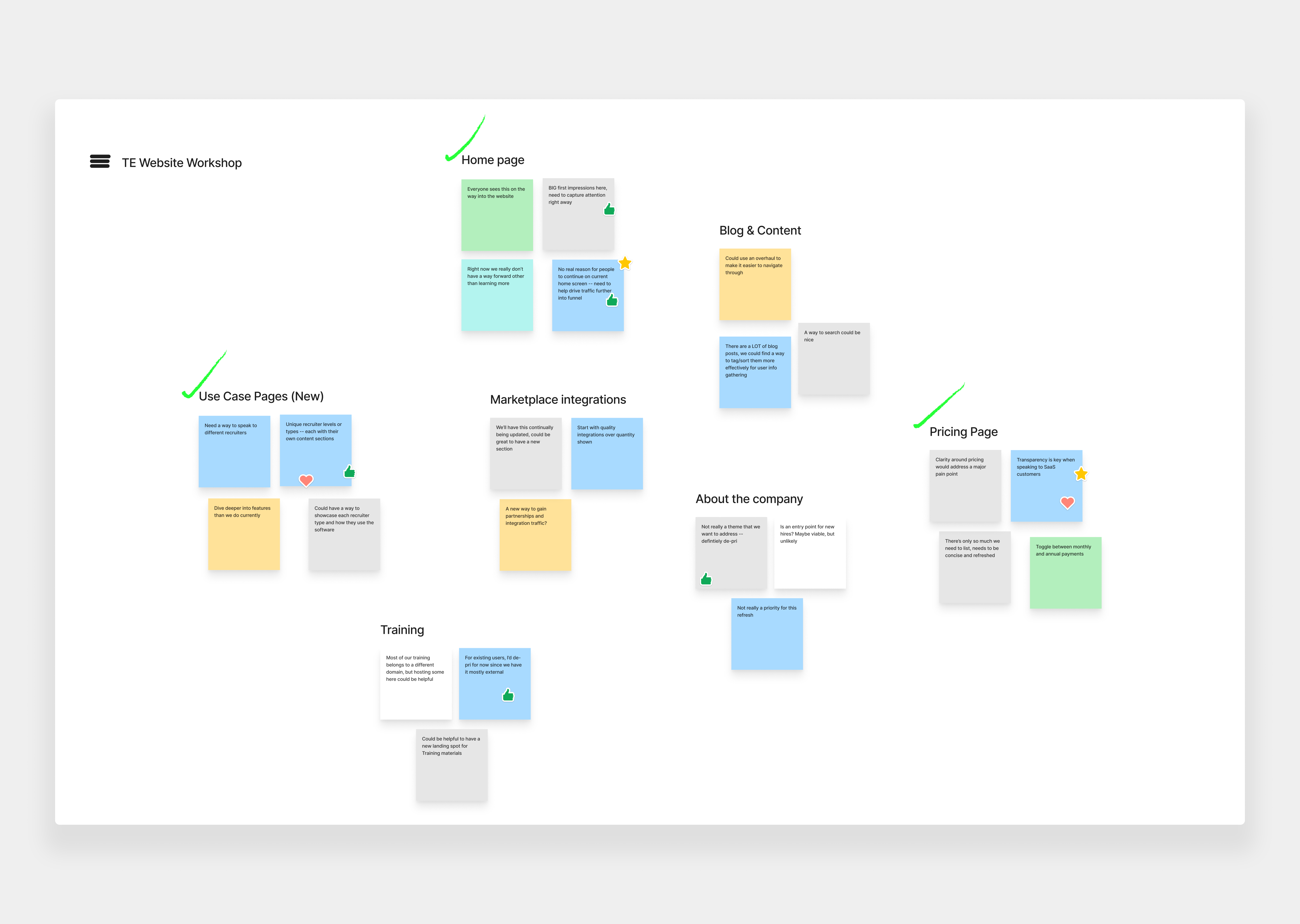
Research
To better understand our recruiters’ pain points, I led 15 interviews: 10 with recruiters and 5 with internal team members with experience collaborating with them.


Impact
There are approximately 27,000 staffing/recruiting companies in the US, according to Staffing Industry Statistics. 75% of recruiters use an ATS to streamline their workflow.
“Being a recruiter is a whirlwind. Juggling phone calls, emails, and placements. Anything that helps me save time in finding a solution is a dream come true."
-A career recruiter, both solo and SMB
“Day in and day out, I need to make so many decisions. Having information and ways to proceed readily available greatly improves my odds of moving forward with your product."
-An industry HR recruiter for an SMB company
Opportunity
In optimizing the website for our recruiting audience, we can truly position Top Echelon to be the SMB recruiting software industry leader that it has shown to be by gaining better traction with our audience. A better experience seeking information and setting up a trial would provide a better overall customer experience for recruiters.
Prioritization
Marketing and Sales goals helped drive priority on pages and focus areas. To maximize our time, I collaborated with our CEO, Marketing Director, and developers to outline two basic workflows: information seeking and proceeding to next steps.
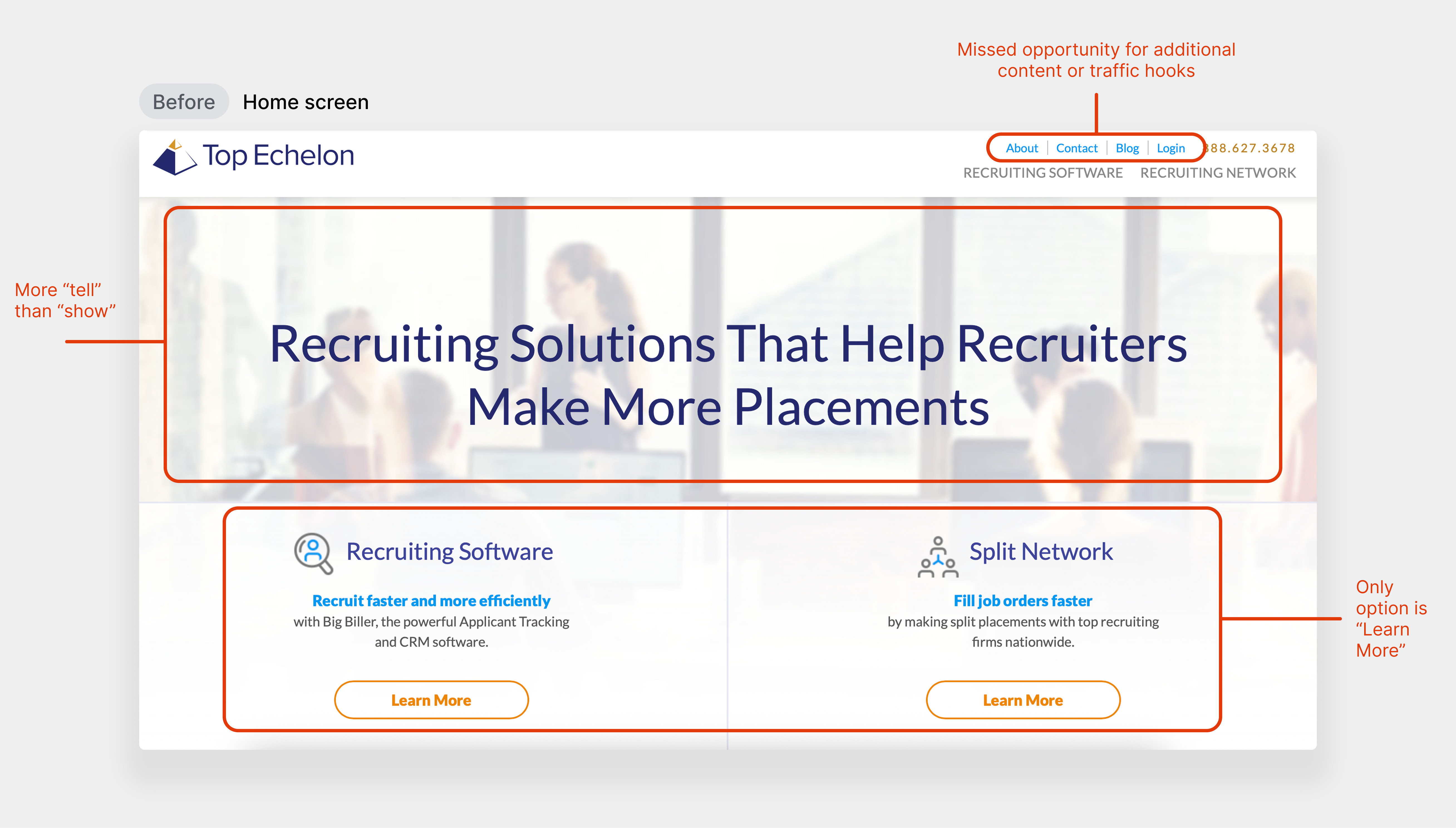
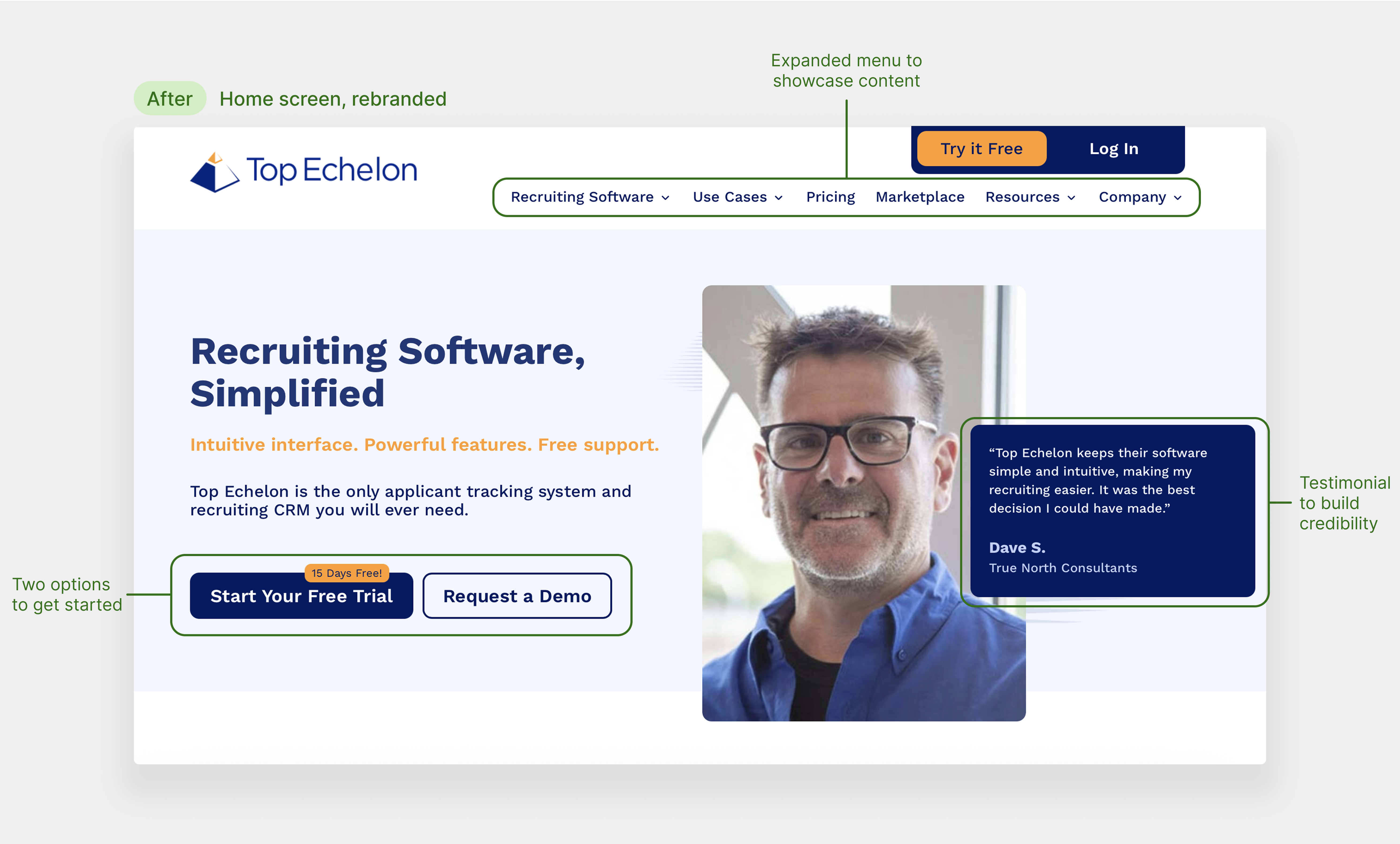
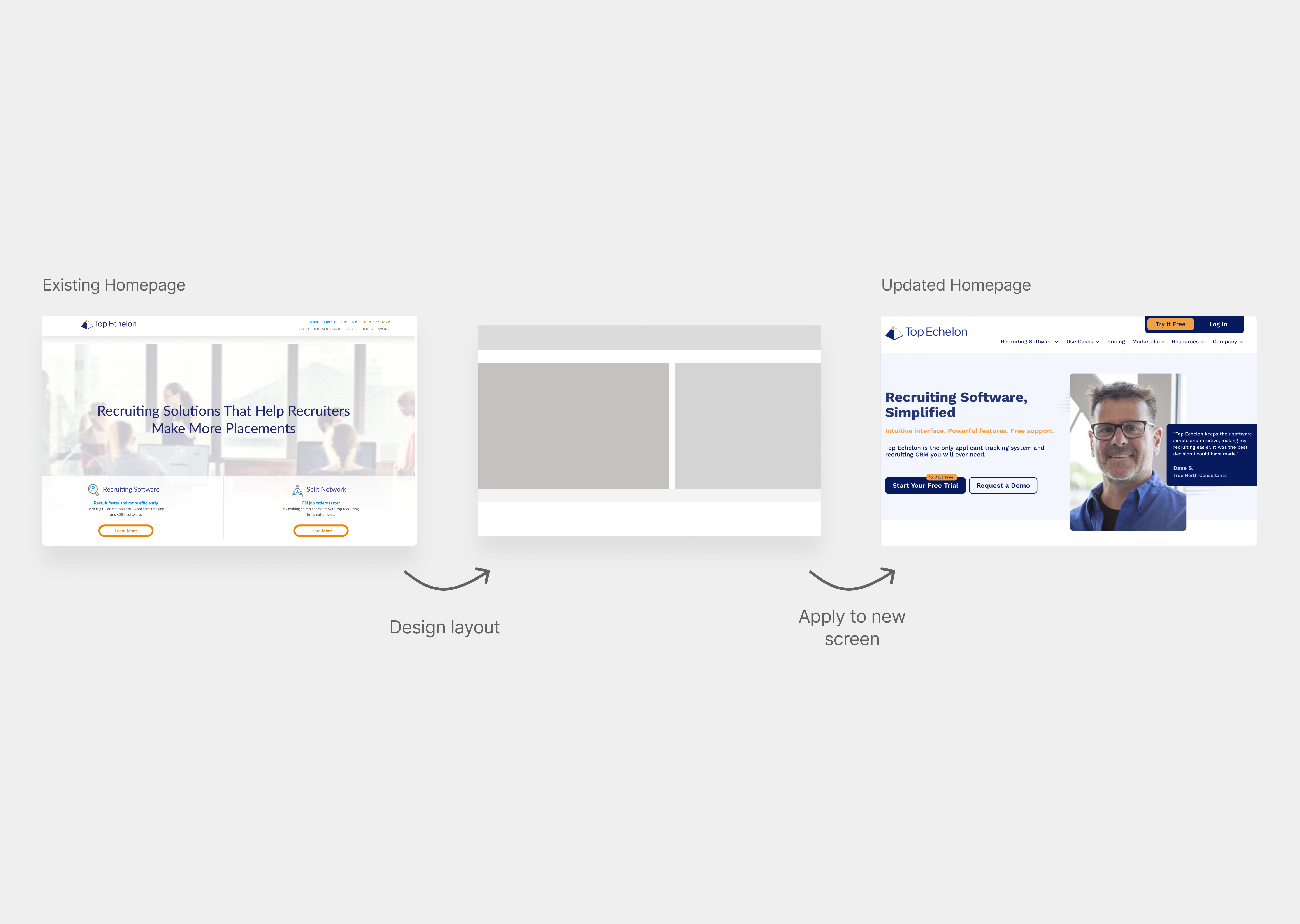
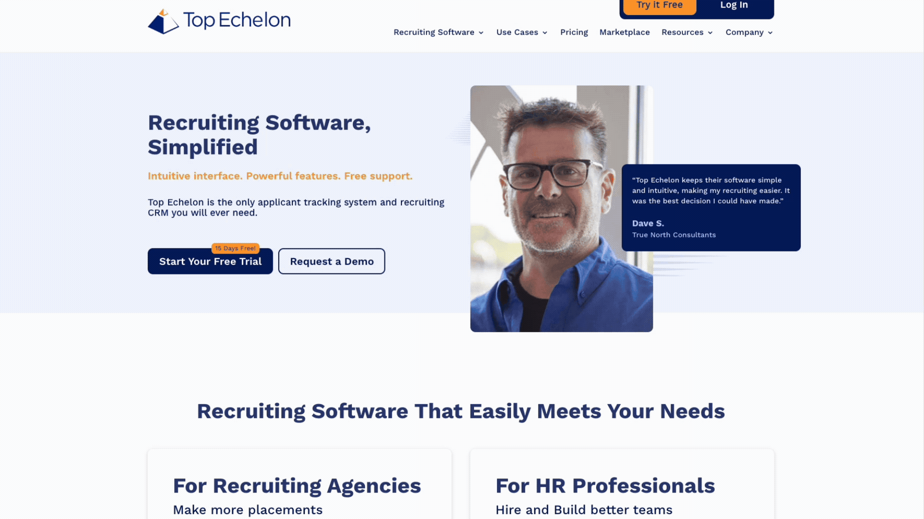
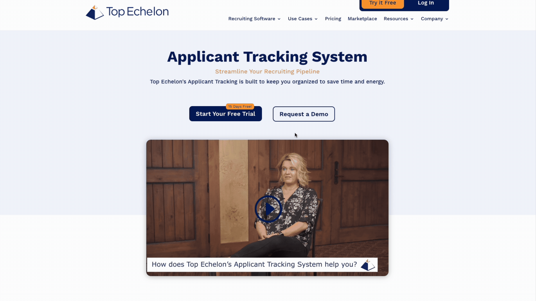
Design Decision #1: Homepage
To keep handoff straightforward for my development team, I designed pages that aligned with industry standards that were kept simple but effective. Keeping it streamlined, we created many new opportunities for content, CTAs, and better navigation options.
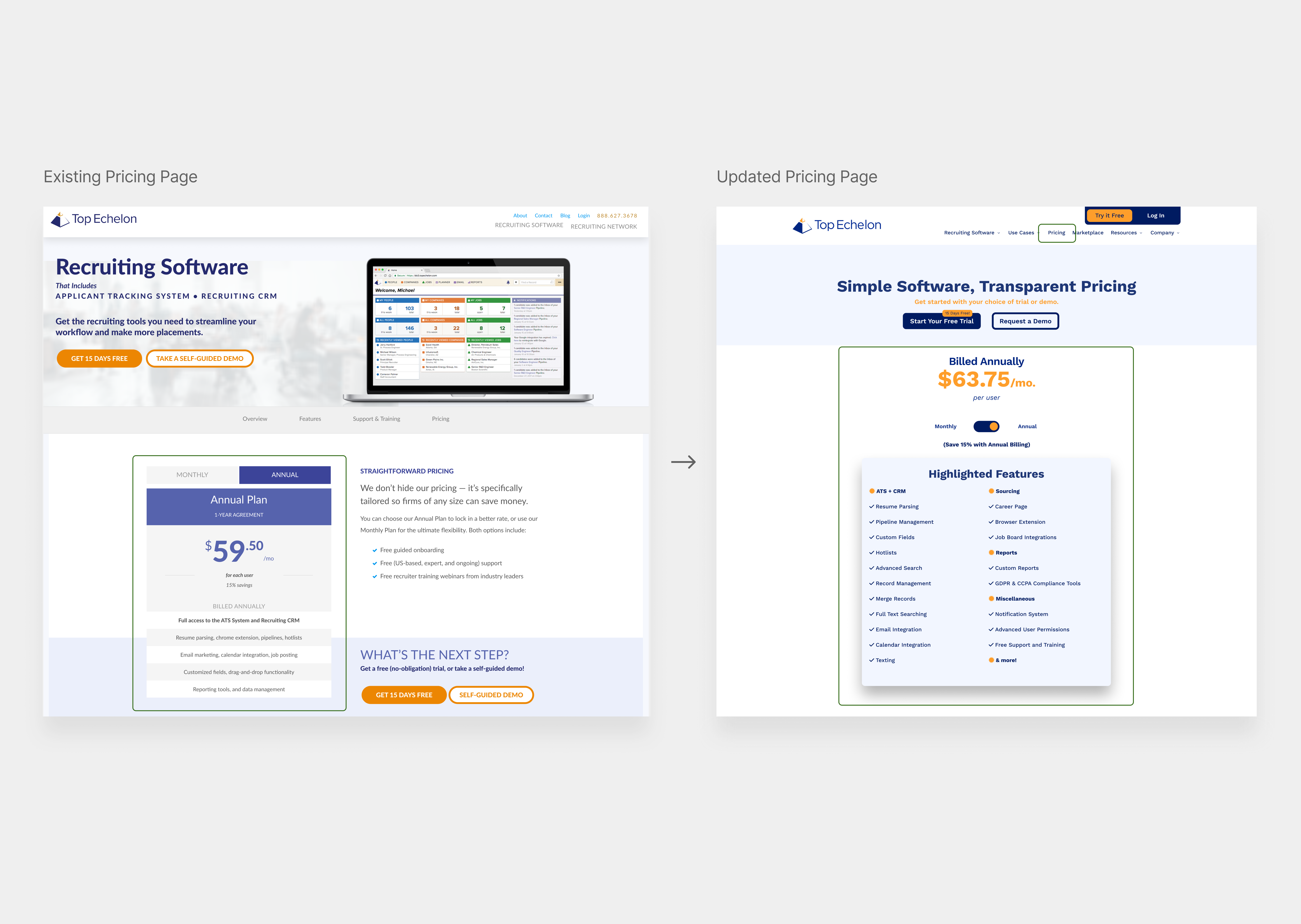
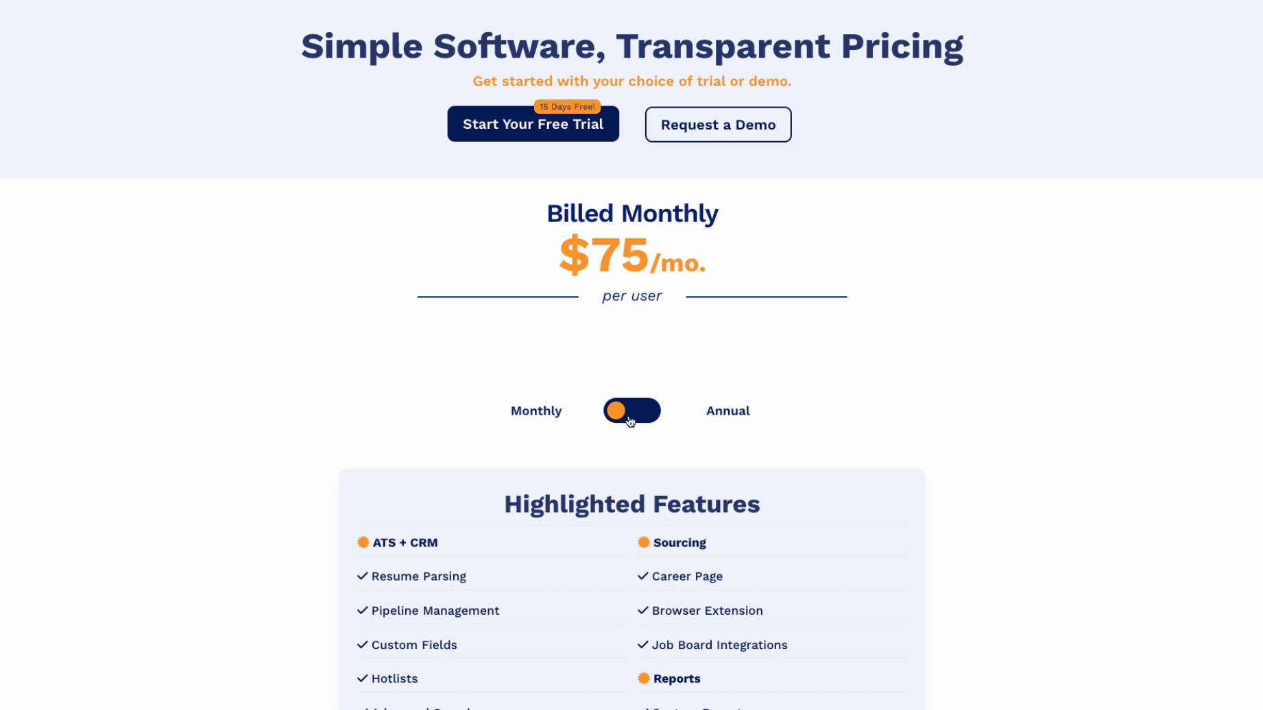
Design Decision #2: Expanded Menu, e.g. Pricing
Top Echelon’s existing pricing section was fairly hidden from most users on the website. Bringing it to the surface made it easier to access and refreshed it to provide clear information without overwhelming users.
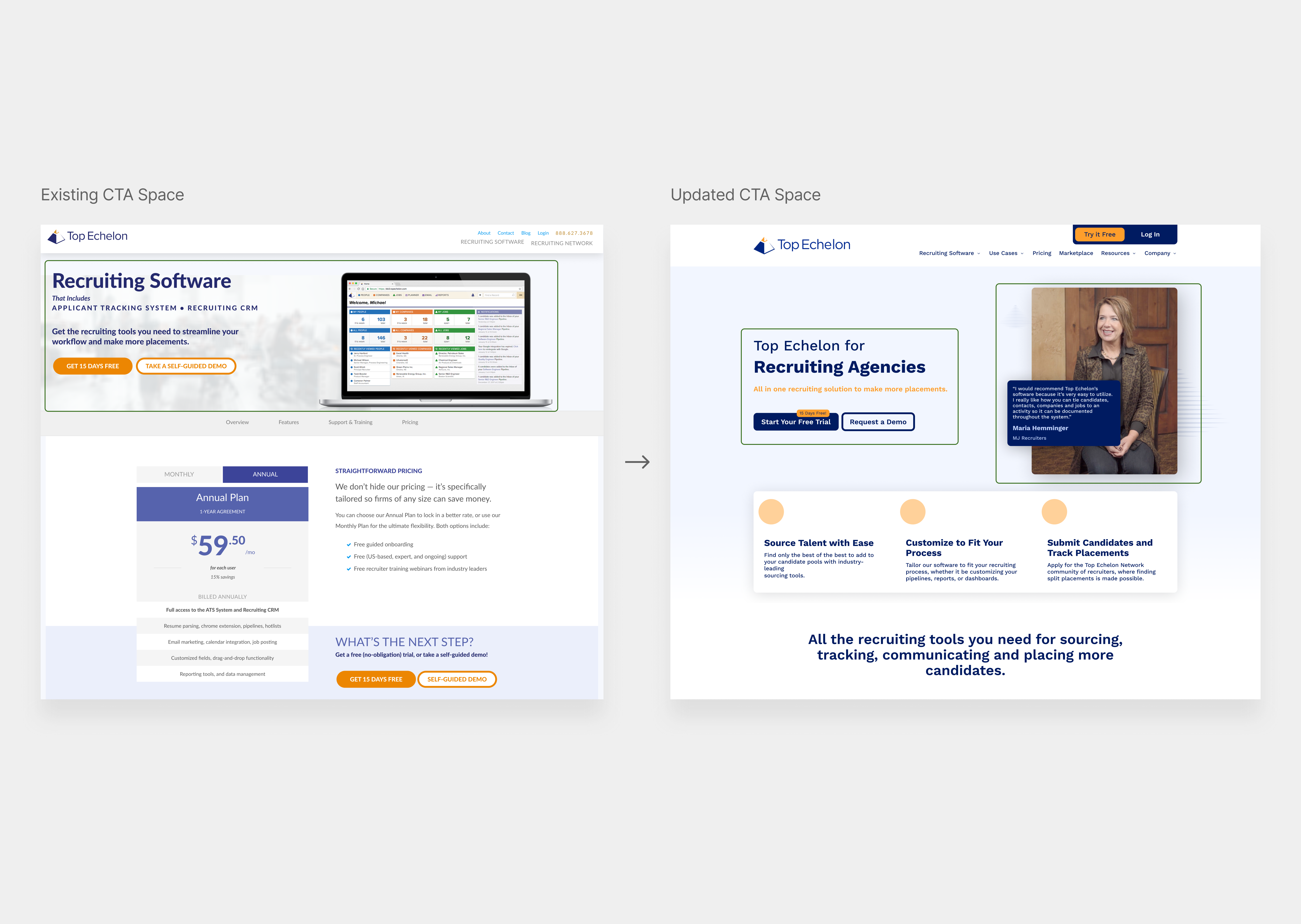
Design Decision #3: Testimonial Use Cases
With such a growing network of recruiters using Top Echelon, we had willing recruiters provide testimonials for different use cases to help support the brand and website transformation. Alongside CTAs, these were meant to drive users to next steps.
Final Designs: Homepage
Most of the final decisions came down to simply tweaking Marketing details. However, the layout stuck throughout the process as it allowed us flexibility to A/B test different messaging and testimonials.
Final Designs: Pricing Page
One of the biggest asks was for more transparency around pricing, something that is hit or miss in the SaaS world. To avoid the pricing being hidden, this pricing model worked well being on the main navigation menu. Lightweight, quick to ship, and high value.
Final Designs: Testimonial Use Cases
As an integral part of all of the pages, we wanted better funnels and entrypoints into our CTAs. Pairing them with unique testimonial content such as the one below showcases the value that recruiters were getting out of Top Echelon’s ATS.
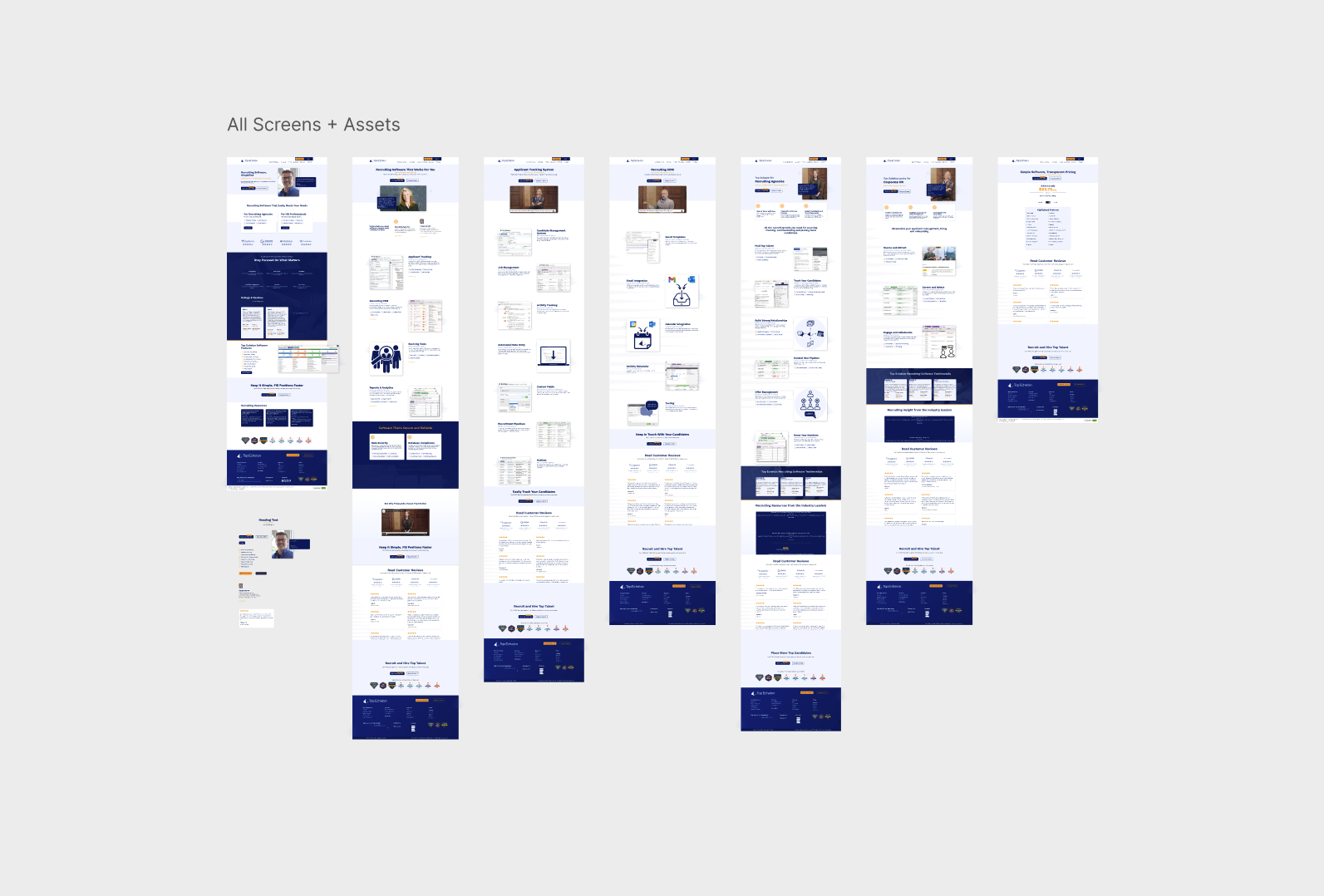
Design Handoff
I created specific handoff Figma files to send over to our engineers that were building out the website and making edits. For each screen that required details, I provided digital sticky notes that went over behaviors and things that couldn’t be displayed. Close collaboration was needed to deliver this final product in full and on-time.
Outcomes

Takeaways
Being one of my first real user experience design projects, I was proud to lead my in-house team in design. Having objective designs and assets to work off of and edit between revisions cannot be understated. Working with an external development team had it’s challenges, but I was much closer to my user group and stakeholders (CEO, Marketing Manager).
This project taught me that you can’t solve for everything. Rather, solve for a few things and do them really, really well.